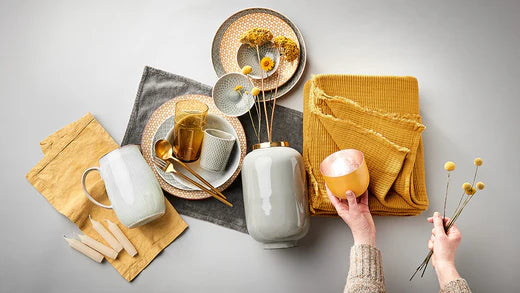
WE INTRODUCE YOU TO THE WINNERS AND OUR FAVORITE SPRING COLORS
2020 turned us and our lives upside down. Of course, we therefore long for the new year to straighten things out. The Pantone Color Institute has now selected two shades and named them the colors of the year 2021 : “Ultimate Gray” and “Illuminating” are the names of the gray and yellow tones on which the focus will be next year.
Fresh and happy. Reliable and familiar. Together with our color favorites for the coming sunny season - cheerful and lively flower tones and classic natural colors - the winning colors bring everything into balance in our home in terms of yin and yang. Harmony and harmony, optimism and consistency - after this challenging year, all of this is welcome. In this blog post we present the Pantone trend colors and our favorites for the new season .
HOPE AND STRENGTH: THIS IS WHAT THE WINNING DUO STANDS FOR
-

What's your favorite? The hopeful and happy yellow or at least ... -

… Rather the solid gray that expresses strength and durability? Or both?
There can only be one. Actually. But sometimes two shades share the winners' podium when the renowned Pantone color institute chooses the color of the year . This is also the case this year, in which a permanent gray and a bright yellow named “Ultimate Gray” and “Illuminating” won .
The fact that it hit these two tones is of course anything but a coincidence. After such an unsteady year as 2020 was, this ensemble comes as it is called with its encouraging message of strength and hope . The solid gray stands for calm and steadfastness, strength and energy, while “Illuminating” express happiness, positivity and hope for a better time.
THE PERFECT MATCH: THE BUTLERS SPRING COLORS

In addition to choosing the color of the year, Pantone also makes other trend forecasts. Which colors will accompany us in the future, regardless of the winning tones, and which will also shape the image in fashion, design and interiors?
In terms of decoration, home accessories and outdoor furniture, at least at BUTLERS, that's already certain. Because we have been guided by the forecasts of the Pantone experts for our collections for the coming seasons. We can reveal one thing: They are primarily tones that express carefree joy and a relaxed, light attitude towards life .
We can use so much positive vibe in our own four walls. After all, the home will continue to play a major role and remain our central place of well-being.
Here are our color favorites for the sunshine and tips on how to combine them with the colors of the year at home:
# 1 LIKE LIFE IN BLOOM:
-

Marsalla, sage, orange, yellow and gray: everything the garden ... -

... has to offer color in spring, we bring us home.
Colorful and cheerful: we simply cannot get enough of floral shades in the coming sunny season. They are a reminder in the truest sense of the word of pulsating life and gardens that bloom in spring . Marsala, henna, ash rose or orange: These tones exude cheerfulness, freshness and confidence and thus contribute to a positive attitude towards life.
In addition, they go perfectly with the radiant winning tone "Illuminating". But other shades of yellow such as honey gold and ocher can also be combined well with the colorful flower tones. Together they are bursting with good humor and liveliness and give hope for better times.
# 2 ALL SHADES OF PLANTS:
-

Ready for the green oasis? Plants and shades of green ... -

... radiate liveliness and freshness in your home.
For some time now, green plants have been an absolute must-have for everyone who wants to bring in their home liveliness and freshness. No wonder that the Pantone range of top colors also includes various shades of green. Whether Rosemary or Cactus - these colors go well with the popular “ Natural Living ” lifestyle , which is about setting up a home that is as close to nature as possible.
# 3 ANYTHING BUT BORING:

As a contrast to the natural green tones and floral flower tones, restrained colors are also coming out big this year. In addition to the winning gray, these are also beige and black. They all act as neutral classics that have a calming effect and can be easily combined with more colorful nuances .

